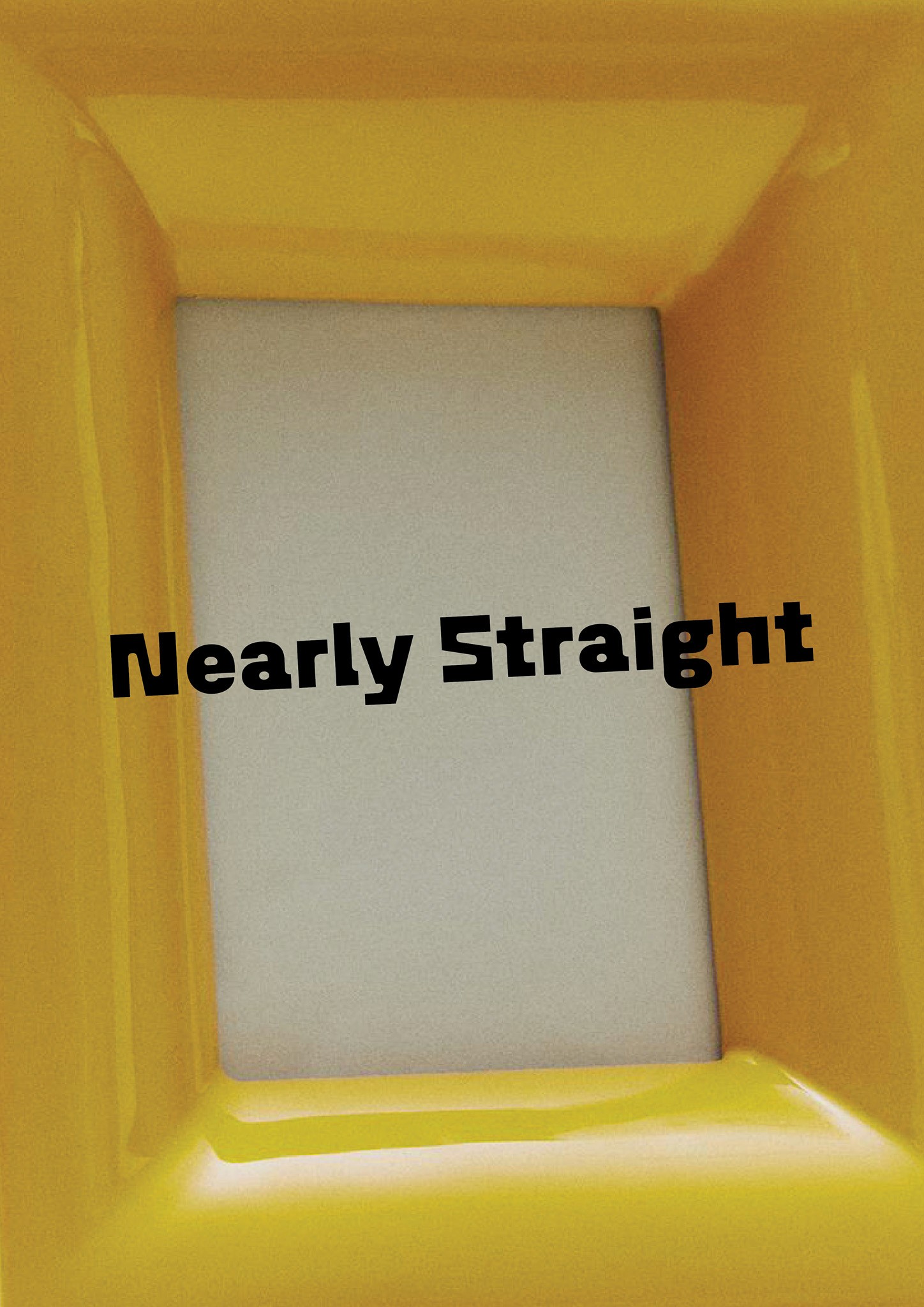
Nearly Straight

Nearly Straight

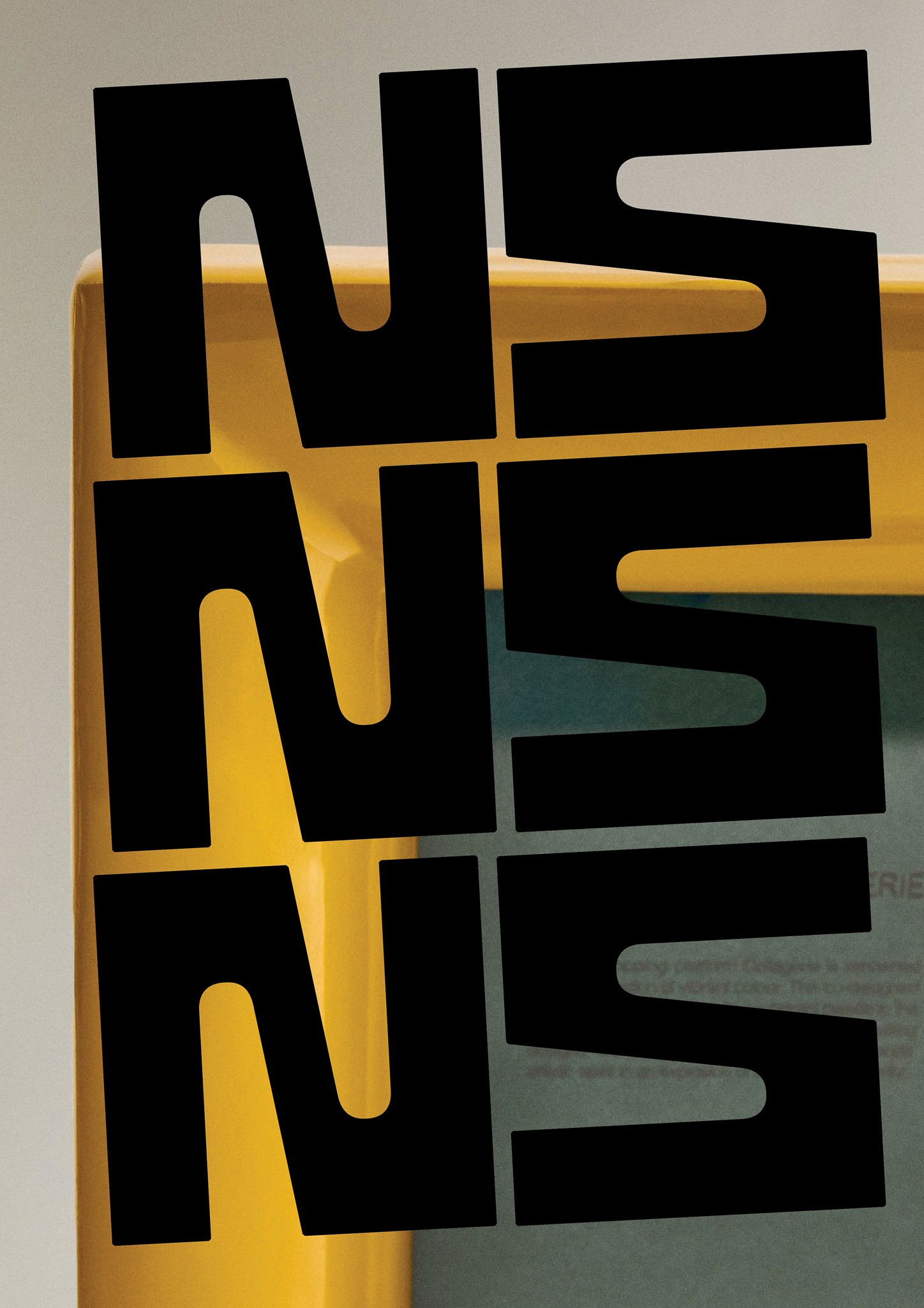
(Logo, Logomark)

(Logo, Logomark)

Nearly Straight is a small art and framing project centred on sourcing vintage and second-hand artworks and giving them new life. Each piece is reframed using reclaimed frames and thoughtfully customised matting, resulting in works that feel considered without becoming overly precious.


The brand is grounded in the idea that imperfection holds value. Its name reflects both the subtle irregularities of slightly crooked artworks and the presence of a human hand, embracing character, nuance and individuality over perfection.


Visually, the identity draws on mid-century influences and vintage logos, balancing a retro sensibility with a contemporary edge. The logotype uses unconventional geometry and a subtle sense of imbalance.


Ultimately, Nearly Straight is about finding beauty in what’s slightly off, elevating the overlooked through thoughtful, hands-on design.

Not sure if your brand is working for you?

Download the free checklist and find out in five minutes.

The best ideas hit at midday. So does our newsletter.

Join the list for design thinking, brand insights, and the occasional hot take delivered when inspiration does.

Midday is based on the South Coast of NSW, on the unceded Country of the Yuin Nation. I acknowledge the Wodi Wodi people of the Dharawal, the traditional custodians of this land, and pay my respects to Elders past and present.

Not sure if your brand is working for you?

Download the free checklist and find out in five minutes.

The best ideas hit at midday. So does our newsletter.

Join the list for design thinking, brand insights, and the occasional hot take delivered when inspiration does.

Midday is based on the South Coast of NSW, on the unceded Country of the Yuin Nation. I acknowledge the Wodi Wodi people of the Dharawal, the traditional custodians of this land, and pay my respects to Elders past and present.

© Midday Design 2026